Logos are the unsung heroes of branding.
Brand marks may seem small, but they pack a powerful punch in representing a company’s identity and values. A well-designed logo can make a lasting impression and attract customers, while a poorly designed one can turn them away.
Whether you’re developing a logo for a new business or refreshing a logo for an existing one, it’s important to understand the elements that make a logo truly stand out.
So, buckle up and get ready to learn the secrets of successful logo design!

Tip 1: Reflect Your Brand Identity
Logos are like fingerprints – they’re unique to each business and can tell you a lot about them.
For example, a logo that resembles a regal lattice or filigree implies the business is sophisticated and refined, while a logo that looks like a cartoon character suggests a playful and fun-loving sort of business.
But logos can also be confusing, especially if there is a lot to it or if the meaning of it gets lost in its artistry. Your logo shouldn’t require an advanced degree to understand it (even if your audience is made up of scholars with advanced degrees).
If your logo falls into this last category, don’t worry – you’re not alone. Just think of it as a conversation starter for when people ask, “What the heck does your logo mean?”
When aligning your logo and your brand’s identity, remember to think about your business’ values and mission. Symbols and icons can be a powerful way to communicate your brand’s identity. Think about what your brand stands for and what you want to convey to your audience, then choose symbols or icons that reflect those values. This can help your logo become a visual shorthand for your brand’s identity.
Key takeaway: Remember, your logo will be the first thing that comes to mind when someone thinks of your business or sees your products or services.

Tip 2: Keep It Simple
When it comes to logos, simple is better than complicated.
Think of it like a first date – unless you’re dating a Hollywood celebrity, you probably don’t want to show up in sequins and feathers. In fact, nobody wants you to do that—especially not your date.
It’s the same with logos – if you try to cram too many colors, fonts, and graphics into a small space, you’ll end up with a hot mess that no one wants to look at. So, keep it simple, keep it classy, and leave the feathers and sequins to the Flaming Lips.
If you think about the most recognizable logos, they all embrace simplicity: McDonald’s golden arches, the Nike “swoosh,” Google’s colorful “G” – all of them are simple, yet all of them are instantly recognizable and iconic.
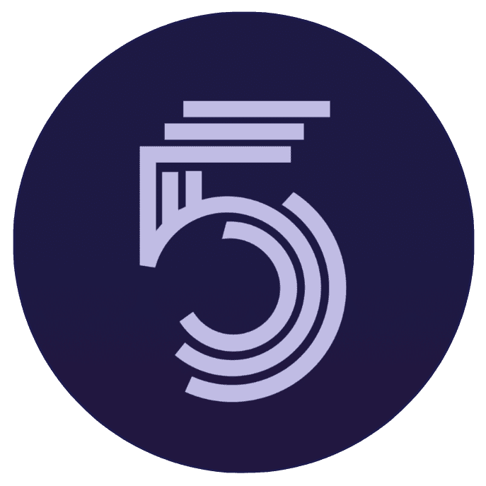
The GATE Logo is a simple font with a golden triangle integrated into the “A.” For us, the triangle represents constant upward motion. It blends our identity—integration and constant improvement—with our philosophy of straightforward, elegant design.
Key takeaway: When developing a logo for your brand, aim for a clean and simple design that is easy to read, easy to like, and doesn’t take a philosophy major to understand.

Tip 3: Convey Emotion with Color
In the world of logo design, there’s a fine line between colors that complement and colors that clash. These nuances matter because your choice will dictate your brand’s color palette and create an emotional response.
In fact, the psychology of color often plays an outsized role in logo development. Red is often associated with passion, excitement, and energy, which is why it’s a popular choice in the food and beverage industry. Blue, on the other hand, is often associated with trust, loyalty, and professionalism, which is why it is popular with many brands in the tech and finance sectors.
Green is often associated with nature, growth, and harmony. Think Whole Foods and Starbucks. Yellow, on the other hand is often associated with happiness, optimism, and creativity. Think McDonald’s and Best Buy.
At the same time, blending colors can create an entirely different set of emotions. Yellow and red can elicit feelings of hunger (even when you’re not hungry). Grey and white, meanwhile, can convey a sense of professionalism and elegance.
Whichever ones you choose, understanding the principles of color psychology can help you create a specific emotional response in your audience and underscore the identity of your brand.
Key takeaway: By choosing the right colors, you can tap into these emotional associations and create a deeper connection with your audience when developing a logo for your brand.

Tip 4: Start with the Right Fonts
The only thing worse than fonts that are difficult to read are fonts that are inconsistent with an organization’s brand. Just like color selection, font selection can give your audience a sense of satisfaction or a sense of confusion. Bold, western-style fonts may not work for women’s fashion apparel, but they may work perfectly for a steakhouse or bar.
Selecting the proper font for your logo is crucial because it will set the tone for your brand’s communication going forward. And by selecting the right font, a brand can attract the right customers and create a connection with them. On the other hand, if the font selection doesn’t match the brand identity, it can send the wrong message and create confusion or even mistrust among customers.
And lastly, understand that a great logo is never simply “typed out.” Once you choose your font, refine it. Alter spacing and tweak some of the characteristics of the typeface, such as altering curves or angles of the lettering to make it your own unique typeface. It doesn’t take much, but it’s enough to make it your own (See Bonus Tip).
Key takeaway: Developing a logo that effectively communicates your message to consumers should include a carefully chosen font that aligns with your brand’s personality and values.
Tip 5: Ensure Scalability
There’s a reason we put scalability behind brand identity, simplicity, color, and font selection – but that doesn’t mean it is any less important. While your logo needs to first convey your brand’s identity and encompass the simplicity and emotion you want people to associate with it, your logo must also stand out wherever you use it.
Because your logo will be used across a range of different platforms, from business cards to billboards, it is essential to ensure that it is scalable and can be resized without losing quality. This is why many successful logos use simple shapes and minimal design elements. While you’re factoring those first four tips into your thinking, be sure to consider how your logo will look at different sizes and on different backgrounds.
⚠️ **ALERT** NERD TALK AHEAD:
Choosing the right file format for your logo can help with the scalability factor. Vector file formats, such as EPS or SVG, are ideal for logos because they are resolution-independent and can be scaled to any size without losing quality. These types of file formats rely on mathematical equations for resizing, instead of pixels, which makes them the perfect format for just about any occasion.
In contrast, raster file formats, such as JPEG or PNG, can become pixelated and blurry when they are scaled up or down. By using vector file formats, you can ensure that your logo will look crisp and clear, no matter how big or small it is displayed. Additionally, using vector file formats allows for easy editing and customization, making it easier to adjust your logo for different applications.
🙌 **ALERT** NERD TALK OVER
Key takeaway: By designing a scalable logo that is simple and easy to recognize, and by choosing the right file format, businesses can create a consistent and recognizable brand mark that looks great across all mediums and sizes.

Tip 6: Make It Timeless
Making a logo timeless is all about creating a design that is simple, clear, and memorable.
One important factor in creating a timeless logo is to avoid using design elements that are too trendy or gimmicky. While it may be tempting to incorporate the latest design fad or technology, it’s important to consider whether it will still be relevant in five, ten, or even twenty years. A timeless logo should be able to stand on its own, regardless of current design trends.
Using the preceding five tips, developing a logo with a timeless design will make it relevant for years to come. If your logo can stand the test of time, chances are your brand will, too!

**BONUS TIP**: Get Professional Help
Developing a logo is probably not something you should do on your own. And we’re not just saying this because we’re logo designers who fear you’d be putting us out of business if you do.
Unless you are a graphic designer or have experience in logo design, it is best to work with a professional. A professional graphic designer can help you create a logo that reflects your brand identity and is effective in communicating your brand message. These people understand the principles of design, color theory, and typography and can use them to create a logo that is both visually appealing and effective.
We are Gate Let’s Do This Together.
Developing or refreshing a logo for your business is a crucial element of your branding strategy and shouldn’t be done hurriedly or without a great deal of deliberation and intention.
If, against everyone else’s better judgment, you do decide to undertake your logo creation on your own, be sure to consider these important tips to create a brand mark that is simple, effective, and communicates your brand message clearly to your customers.
If (when) that doesn’t work, consider working with GATE. We are a professional branding and design agency with years of experience creating effective and memorable logos for businesses of all sizes and industries. Our team of experts works closely with our clients to understand their unique needs and goals and tailor our designs to meet those needs.
We strive to create logos that are not only visually appealing but also scalable, versatile, and memorable. Whether you need a simple logo design or a complex brand strategy, we can help you establish a strong and consistent brand mark that sets you apart from your competitors.
So, if you’re ready to take your brand to the next level, contact GATE today, and let’s do this together.