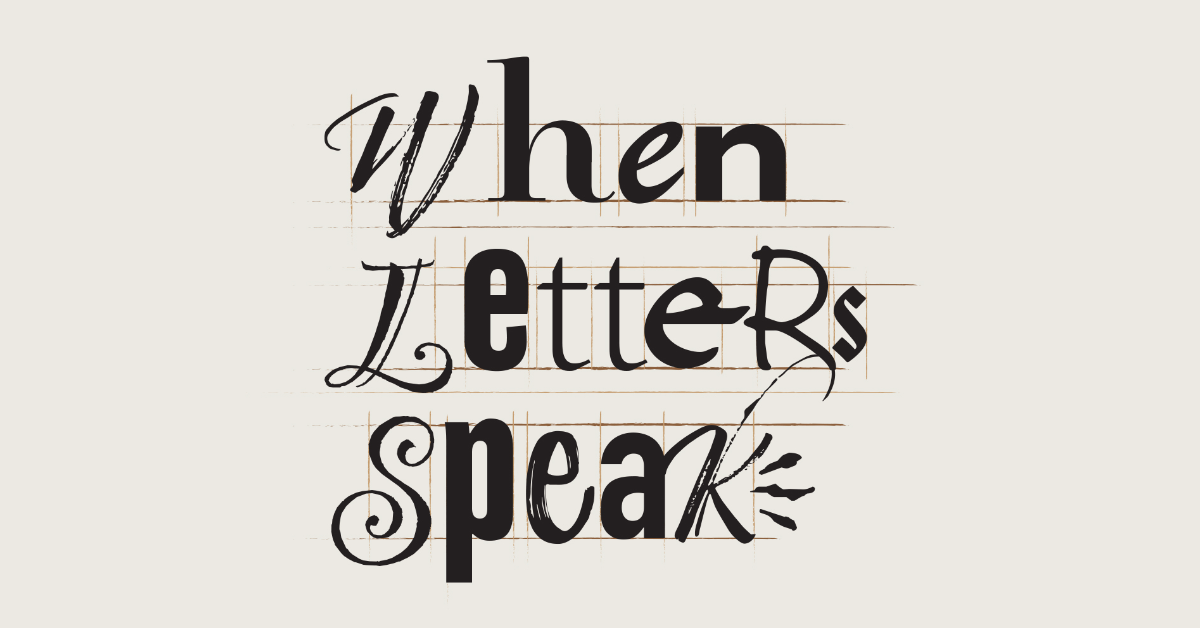
In an age of endless visual noise, the quiet power of typography often speaks the loudest.
More than just selecting fonts from a dropdown menu, typography is the art of making language visible – giving voice, emotion, and impact to words that might otherwise fade into oblivion.
While many see typography as simply choosing between Helvetica or Times New Roman, true typographic artistry exists in a realm far beyond the standard font library. It’s in the careful manipulation of letterforms, the strategic use of space, and the delicate balance between readability and visual impact.
This manipulation isn’t arbitrary; it’s a deliberate choice that transforms words into visual stories.
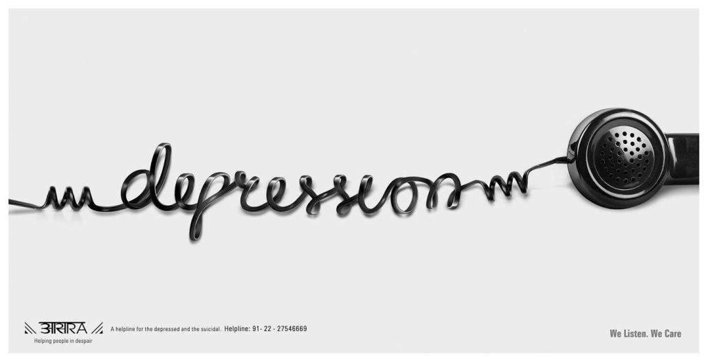
Consider the masterful AARSA helpline advertisement, created by Makani Creatives in Mumbai, India, where a phone cord twists and turns to spell out the word “depression” in a single, continuous line. This isn’t just clever design – it’s typography that viscerally communicates isolation and the lifeline of connection.
It’s one of the best examples of how the medium can, quite literally, become the message.
The Psychology of Visual Hierarchy
Typography isn’t just about making words look good – it’s about making them work hard. Every typographic choice creates a hierarchy that guides the reader’s eye and shapes their understanding. Think of it as choreographing the dance of attention across a page or screen.
The “You Will Read This First” example, designed by the Florida-based Appleton Creative agency, demonstrates this principle with stark clarity.
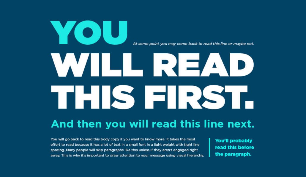
By understanding how human eyes naturally process information, designers can create typographic arrangements that are part of a fuller, richer experience that goes beyond a simple read. This creative hierarchy isn’t just about size or weight; it’s about laying out a visual journey that renders the viewer helpless against the desire for more information.
Typography as Brand DNA
While a brand’s logo might feature custom typography, the art extends far beyond that singular mark. The true power lies in knowing when to let your brand typography take center stage and when to let campaign-specific typography carry the emotional weight of a message.
Brand typography exists on two distinct but complementary levels. Core brand fonts establish consistent identity, while campaign typography pushes creative boundaries to deliver specific messages with maximum impact. This dual approach lets organizations maintain their foundational brand voice while creating powerful, contextual expressions that resonate with targeted audiences.
Both core fonts and campaign fonts should be part of a brand’s style guide, but they operate independently to serve different purposes.
The Impact of Intention
Creating impactful typography requires a delicate balance between boldness and subtlety, between commanding attention and serving the message. The most effective typographic design feels intentional yet natural, striking yet accessible. It should communicate clearly while maintaining its creative impact, regardless of the audience’s sophistication level.
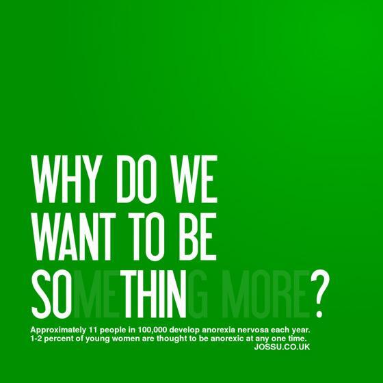
Perhaps the most striking example of typography’s power of profundity comes in social impact campaigns. Along the lines of the “depression” ad, the anorexia awareness poster that plays with the word “thin” demonstrates how typography can make complex issues immediately visceral and understood.
Beyond the visual aspect of the typography, the word choice itself provides a deeper message and drives home the harrowing nature of the disorder. By manipulating the visual weight and presence of letters, the design speaks volumes about body image and society’s dangerous obsession with thinness—all without requiring a single additional image.
The Digital Age Challenge
Today’s digital landscape presents new challenges and opportunities for typography usage. Brands must ensure their typographic choices work across multiple platforms and screen sizes while maintaining their impact and legibility. This has led to a renaissance in responsive typography, where letters adapt and change based on viewing context without losing their essential character.
This drive for digital adaptability has contributed to what some designers call “the blanding of branding“—a phenomenon where brands adopt nearly identical minimalist typographic approaches in pursuit of clarity and versatility. Look around and you’ll see countless companies using the same geometric sans-serif fonts, similar spacing, and stripped-down aesthetics. While this approach ensures legibility across platforms, it often sacrifices the very distinctiveness that makes brands memorable.
The rise of social media has also created new demands for typography that can stop the endless scroll—designs that capture attention in milliseconds while conveying complex brand messages. In this homogenized landscape, brands that thoughtfully break from the “bland” pack through distinctive typography often find themselves with a powerful competitive advantage. This requires an even more nuanced understanding of how typography can work harder than ever before and strike a balance between digital practicality and creative distinction.
Breaking the Rules with Purpose
While understanding typographic rules is essential, knowing when and how to break them can lead to some of the most memorable brand moments.
Take FedEx’s iconic logo, which breaks traditional spacing rules by hiding an arrow between the ‘E’ and ‘x’—a subtle rule-break that brilliantly communicates forward motion and precision delivery.
However, this kind of creative manipulation requires a deep understanding of typography’s fundamentals. The adage, “You have to know the rules to break them effectively,” certainly transcends branding and design but is a hallmark of the advertising industry, nonetheless. The delicate balance between convention and innovation often marks the difference between gimmicky design and truly inspiring typography.
Typography in Action: Making It Work
The real power of typography emerges when theory meets practice. Effective typography isn’t just about choosing the right style—it’s about consistent application across all touchpoints. From business cards to billboards and website headers to mobile apps, every instance of typography should reinforce your brand’s voice and values. This consistency builds trust and recognition over time, turning simple letters into powerful brand assets.
Smart brands also understand that typography needs room to breathe. White space isn’t empty space—it’s an active design element that gives typography its power. The strategic use of spacing can mark the difference between typography that whispers and typography that commands attention.
Ready to transform your brand’s visual voice through the power of typography?
At Gate, we understand that every letter, space, and visual choice is an opportunity to strengthen your brand’s connection with its audience. Our team of designers and strategists can help you develop typography that doesn’t just communicate—it resonates. Reach out to us today to get started!
We are Gate. Let’s do this together.